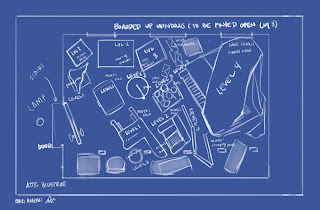


The layout is mostly for me, the whole 'levels' thing is actually just a concept I came up with that splits my game idea into parts.
You're not really supposed to walk around in this room, as you can tell, you're just supposed to pick up items and leave with them. Once one level is cleared, there is a reward, and you move onto the next level.
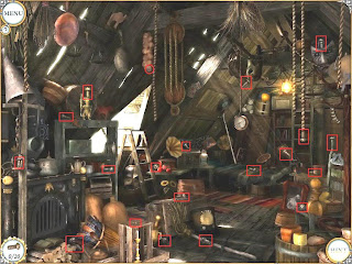
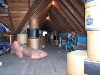
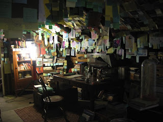
The other pictures are references to the kind of feel I want in both texture and/or design of the overall attic.

It's an interesting idea to fill the whole room with "clutter" and have the objective be emptying the room.
ReplyDeleteI know in the original concept (and in the blueprint) you only have light coming in from the outside, but perhaps we might want to add another light source to avoid having the room to dark. It depends on the feeling you want to portray. If it isn't supposed to be scary or intimidating (which I didn't think you were going for) I would add another type of light. Maybe if the boarded up windows were a bit hap-hazard so that some sun/moonlight could sneak in? Or maybe a light in the attic that you turn on like in the bottom left reference? The bottom right is definitely more menacing and gives more of a mystery feel not only from the type and lack of light, but also the color. So again, up to you but it's something you want to make a conscious decision on.